

This is the 2000 AD promotional campaign that ran for 4 weeks on CBR, for the return of The Dark Judges, Fear, Fire and Mortis in the Judge Dredd story Day of Chaos. Each week one set of posters was released, hinting at the contents of the story to come.
WEEK 1


Although these are the simplest of the 4 waves of artwork, they almost took the most time to do. Apart from setting the style for the rest of the campaign I also had to come up with a way to represent each of the 3 characters as a minimal but relevant symbol. Myself, Mike Molcher, the PR bot and Luke, the other 2000 AD designer, knocked around loads of ideas before settling on the 3 symbols shown here.

Judge Mortis was by far the hardest to come up with. How do you describe decay or entropy in a few stylised lines? I don't think I've not seen a single person guess what that symbol means yet unfortunately... it's a pile of smoking ash. Almost the hideous aftermath of Mortis' touch. I got the idea from watching Dr. Brian Cox explaining entropy on TV using a pile of sand, which I remember being pretty cool. The other two are slightly more obvious - an eye for Fear (he has loads them inside his helmet in one story, and there's plenty of wide-eyed victims in Brian Bolland's art) and flames (duh?) for Fire. I was worried, knowing their meanings, that everyone would guess them straight away. Luckily only one guy guessed correctly - and nobody seemed to notice!


Judge Mortis was by far the hardest to come up with. How do you describe decay or entropy in a few stylised lines? I don't think I've not seen a single person guess what that symbol means yet unfortunately... it's a pile of smoking ash. Almost the hideous aftermath of Mortis' touch. I got the idea from watching Dr. Brian Cox explaining entropy on TV using a pile of sand, which I remember being pretty cool. The other two are slightly more obvious - an eye for Fear (he has loads them inside his helmet in one story, and there's plenty of wide-eyed victims in Brian Bolland's art) and flames (duh?) for Fire. I was worried, knowing their meanings, that everyone would guess them straight away. Luckily only one guy guessed correctly - and nobody seemed to notice!

Below are the initial ideas I came up with in InDesign for various stages of the campaign before it started. Almost everything on here was changed on the final versions. Notice I started off doing a matching poster for Judge Death as well (just for completeness sake, and my own bloody-mindedness) but soon had to stop as the art got more complex and deadlines loomed!

WEEK 2


In the second week I decided to focus on the Dark Judges weapons, or powers, but linked the art to the first wave of images by making the original symbols into a background for the new ones.

These are probably my favourite posters of the lot, as they're still quite graphic, but with enough texture and detail to have a bit of depth. I also started going to town in photoshop, adding more texture than previously.


These are probably my favourite posters of the lot, as they're still quite graphic, but with enough texture and detail to have a bit of depth. I also started going to town in photoshop, adding more texture than previously.

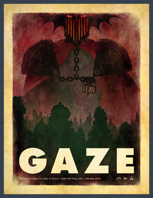
WEEK 3


The third week was all about face shots. We pretty much expected everyone with 1/2 a brain to have got the hint by now, so we changed the text a bit. Si Spurrier came up with the idea of using GAZE, BURN and DECAY instead of the Judge's name running along the bottom, which fitted with the theme we'd set really nicely. Just glad we didn't have to come up with a Judge Death version for that. What would we have written? CRIME? LIFE? I dunno. It still annoys me I can't think of a good one (even though it has no bearing at all...)


Had a bit of a false start with these ones. After banging out Fear very quickly and satisfactorily I made a bit of a balls up of Mortis and Fire - both of which where far too illustrative. I had to quickly redo both on deadline day after a hurried chat with Molcher. He was apologetic but absolutely right in thinking they don't match the look of any of the other bits of art, so I changed them. I kind of knew they weren't right, but I'd run out of steam on Friday night and was a bit stuck. Just as I was getting panicky, Luke helped me out by coming up with a much cooler, more stylised version of my original skull picture, which kind of kick-started the mortis one. The original pictures are below.

Week 4

The final pictures for the campaign! Went right to the wire on this one again as they were getting so complex I was having trouble fitting them in around my other work.


Below are the rough mockups I did in Indesign. I don't normally work like this, but as art is so graphic and stylised it was much quicker to mock them up this way before I started the proper art in Illustrator and then Photoshop

Below are the rough mockups I did in Indesign. I don't normally work like this, but as art is so graphic and stylised it was much quicker to mock them up this way before I started the proper art in Illustrator and then Photoshop
These final 3 images are now available as posters on the 2000 AD online store - go buy one!


The last thing we did at the campaign climax was to black out the 2000 AD website for a day when the prog came out, replacing it instead with the image below.


